Numpak Bis Ga Pake Ribet!
Numpak Bis Ga Pake Ribet!
Numpak Bis Ga Pake Ribet!
Overview
Overview
Overview
I redesigned Gobis Suroboyo to help users find routes faster, track buses in real-time, and buy tickets easily. My goal was to create a clearer, friendlier, and more efficient experience that makes daily commuting stress-free.
I redesigned Gobis Suroboyo to help users find routes faster, track buses in real-time, and buy tickets easily. My goal was to create a clearer, friendlier, and more efficient experience that makes daily commuting stress-free.
I redesigned Gobis Suroboyo to help users find routes faster, track buses in real-time, and buy tickets easily. My goal was to create a clearer, friendlier, and more efficient experience that makes daily commuting stress-free.
Timeline
Timeline
Timeline
2 days delivery
2 days delivery
2 days delivery
Role
Role
Role
UX Designer - responsible for shaping the end-to-end experience through research, ideation, prototyping, and testing
UX Designer - responsible for shaping the end-to-end experience through research, ideation, prototyping, and testing
UX Designer - responsible for shaping the end-to-end experience through research, ideation, prototyping, and testing
Role
Role
Guiding Every Ride
Guiding Every Ride
Guiding Every Ride
I led the redesign by researching user needs, mapping journeys, and creating intuitive interfaces. I focused on simplifying planning, tracking, and ticketing to make the app clear, fast, and friendly.
I led the redesign by researching user needs, mapping journeys, and creating intuitive interfaces. I focused on simplifying planning, tracking, and ticketing to make the app clear, fast, and friendly.
I led the redesign by researching user needs, mapping journeys, and creating intuitive interfaces. I focused on simplifying planning, tracking, and ticketing to make the app clear, fast, and friendly.
Key Challenges
Key Challenges
Frictions On Every Screen
Frictions On Every Screen
Frictions On Every Screen
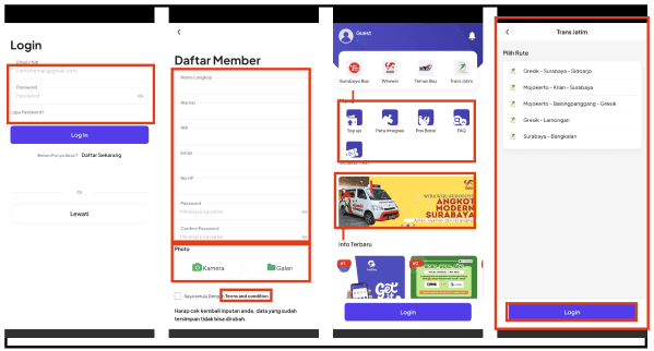
Inconsistent Navigation
Inconsistent Navigation
Inconsistent Navigation
Users struggle to navigate consistently across different screens because menu placement and buttons vary, making it hard to predict where to go next.
Users struggle to navigate consistently across different screens because menu placement and buttons vary, making it hard to predict where to go next.
Users struggle to navigate consistently across different screens because menu placement and buttons vary, making it hard to predict where to go next.
Overcrowded Visual
Overcrowded Visual
Overcrowded Visual
Screens feel too busy and overwhelming, with many elements competing for attention, distracting users from key actions like route selection or ticketing.
Screens feel too busy and overwhelming, with many elements competing for attention, distracting users from key actions like route selection or ticketing.
Screens feel too busy and overwhelming, with many elements competing for attention, distracting users from key actions like route selection or ticketing.
Information Not Well Organized
Information Not Well Organized
Information Not Well Organized
Important info such as bus times, stops, and fares is scattered or hidden, causing confusion and delays when planning trips.
Important info such as bus times, stops, and fares is scattered or hidden, causing confusion and delays when planning trips.
Important info such as bus times, stops, and fares is scattered or hidden, causing confusion and delays when planning trips.
Confusing Flow
Confusing Flow
Confusing Flow
The steps to plan a trip or buy a ticket are not intuitive, forcing users to backtrack or abandon actions.
The steps to plan a trip or buy a ticket are not intuitive, forcing users to backtrack or abandon actions.
The steps to plan a trip or buy a ticket are not intuitive, forcing users to backtrack or abandon actions.
Method
Method
Uncovering Hidden Barriers
Uncovering Hidden Barriers
Uncovering Hidden Barriers
I used Heuristic Evaluation to identify usability issues in the current app. Each screen was reviewed using Jakob Nielsen’s 10 principles, then rated with a severity scale — from minor irritation to major breakdown. This helped me see where users struggle the most and what to prioritize in the redesign.
I used Heuristic Evaluation to identify usability issues in the current app. Each screen was reviewed using Jakob Nielsen’s 10 principles, then rated with a severity scale — from minor irritation to major breakdown. This helped me see where users struggle the most and what to prioritize in the redesign.
I used Heuristic Evaluation to identify usability issues in the current app. Each screen was reviewed using Jakob Nielsen’s 10 principles, then rated with a severity scale — from minor irritation to major breakdown. This helped me see where users struggle the most and what to prioritize in the redesign.

Design Process
Design Process
Building from Clarity
Building from Clarity
Building from Clarity
I started by collecting visual references and creating a design system — colors, typography, and components that reflect Surabaya’s energetic yet friendly vibe. This became the foundation for a consistent and scalable redesign.
I started by collecting visual references and creating a design system — colors, typography, and components that reflect Surabaya’s energetic yet friendly vibe. This became the foundation for a consistent and scalable redesign.
I started by collecting visual references and creating a design system — colors, typography, and components that reflect Surabaya’s energetic yet friendly vibe. This became the foundation for a consistent and scalable redesign.
Design System


From Lines to Logic
From Lines to Logic
From Lines to Logic
Then, I created wireframes to explore structure and user flow. It helped me focus on usability first — ensuring every action felt intuitive before moving to visuals.
Then, I created wireframes to explore structure and user flow. It helped me focus on usability first — ensuring every action felt intuitive before moving to visuals.
Then, I created wireframes to explore structure and user flow. It helped me focus on usability first — ensuring every action felt intuitive before moving to visuals.
Then, I created wireframes to explore structure and user flow. It helped me focus on usability first — ensuring every action felt intuitive before moving to visuals.
Frame Iphone 16: 393x852px
Frame Iphone 16: 393x852px
Frame Iphone 16: 393x852px

Where Ideas Click
Where Ideas Click
Where Ideas Click
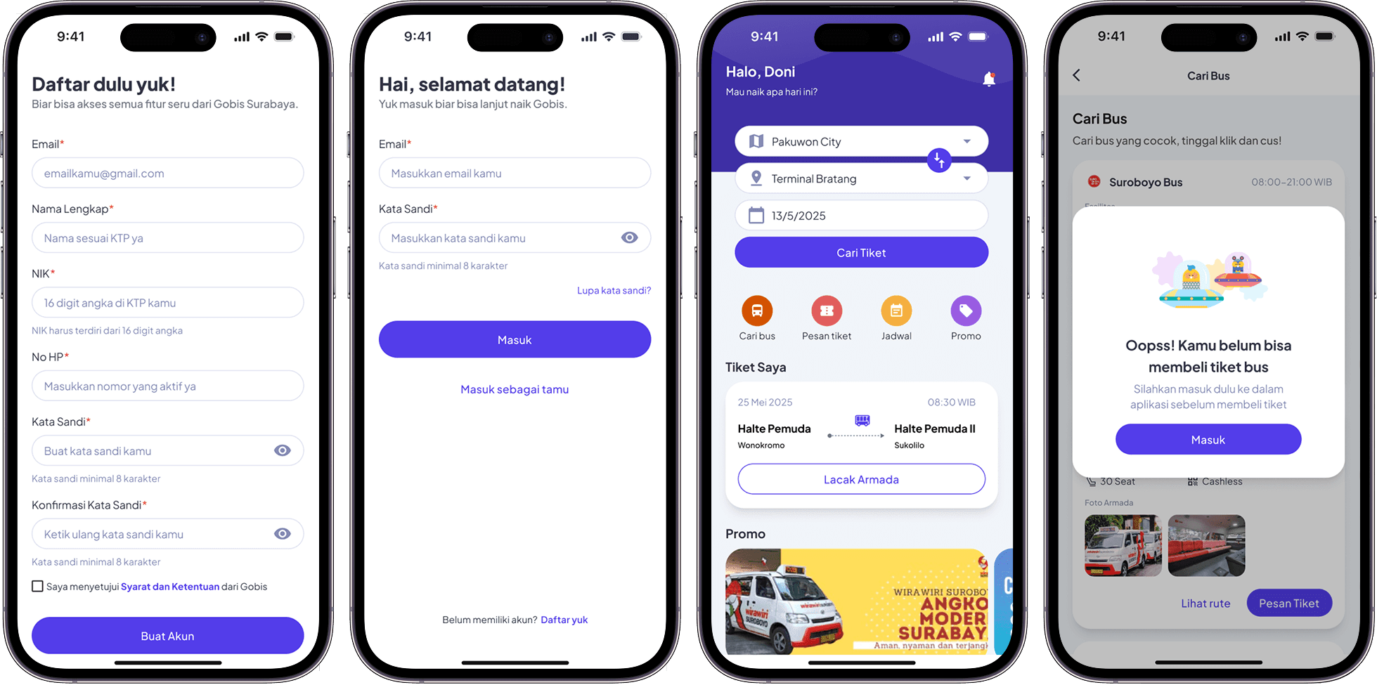
Finally, I translated wireframes into high-fidelity designs — clean, vibrant, and easy to navigate. The result is a modern app that feels more human and seamless for daily commuters.
Finally, I translated wireframes into high-fidelity designs — clean, vibrant, and easy to navigate. The result is a modern app that feels more human and seamless for daily commuters.
Finally, I translated wireframes into high-fidelity designs — clean, vibrant, and easy to navigate. The result is a modern app that feels more human and seamless for daily commuters.

@ 2025 All rights reserved
@ 2025 All rights reserved


