Noriba — Verification That Keeps People Moving
Reduced onboarding drop-off by 30% on a syariah BNPL platform through a shorter, smarter verification flow.
Role
UI/UX Designer
Industry
Fintech
Team
UI/UX Designer, Product Owner, Marketing, Developer
Year
2025
Background
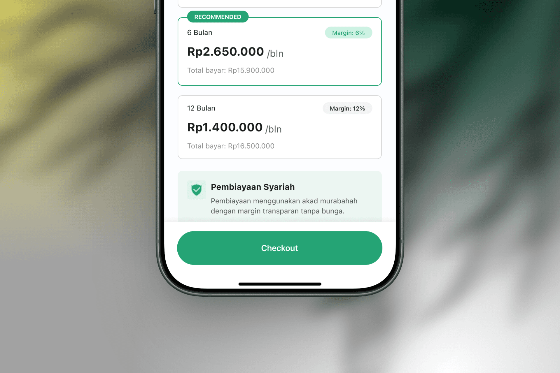
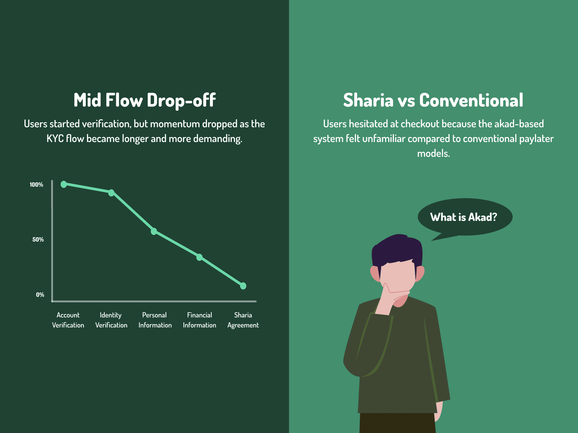
Noriba is a sharia-compliant buy now pay later platform, offering installments without interest. The product worked. Two experience failures were quietly killing conversion before users ever completed their first purchase.
Understanding the problem

The Goal
Three things had to be true by the end of this project.
Users who exit mid-verification can resume exactly where they left off, with no lost progress.
The explanation of Noriba's akad-based model appears exactly when trust is in question, not three screens before it matters.
Hesitation at tenor selection and checkout turns into confidence, not more text to read.
Key Findings
DEFINE
So what are we actually solving?
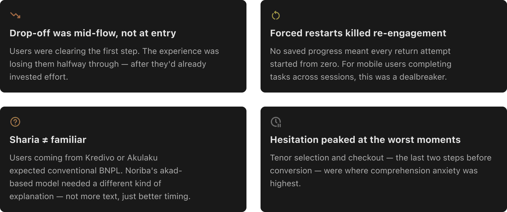
How might we let users who exit mid-verification resume exactly where they left off — without losing any completed work?
How might we surface the right explanation at the exact moment users need confidence — not three screens before it matters?
CONSTRAINTS
Every solution had to work within limits that weren't going away.
Regulatory
KYC steps couldn't be removed, only re-sequenced. Verification, financial data, and the sharia agreement stayed mandatory.Timeline
Two weeks before the next release. No room for new architecture.Engineering resources
A full rebuild wasn't feasible. I scoped the fix to what could ship fast, and left deeper changes for the next iteration.
Design Decision 1
FEWER STEPS, NOT FEWER REQUIREMENTS
KYC had six steps, but the requirements behind them hadn't earned that many. I regrouped related inputs, ID with selfie, personal data with address, cutting the flow to four steps without removing a single regulatory checkpoint.
Each extra step is a chance to lose someone. Fewer steps meant fewer chances to quit, without cutting a single requirement compliance needed.
ID + Selfie → Personal Data + Address → Income → Review

Design decision 2
PROGRESS YOU CAN'T LOSE
Exiting mid-flow used to reset everything. Users who left to grab a document, or just got interrupted, came back to a blank form and often didn't finish at all.
I added persistent save state. Every completed step can be saved with a single tap, giving users control over when their progress is locked in. This didn't need a backend rebuild, just session persistence layered onto the existing flow, work that fit the time we had.

DESIGN DECISION 3
CONTEXT AT THE MOMENT OF COMMITMENT
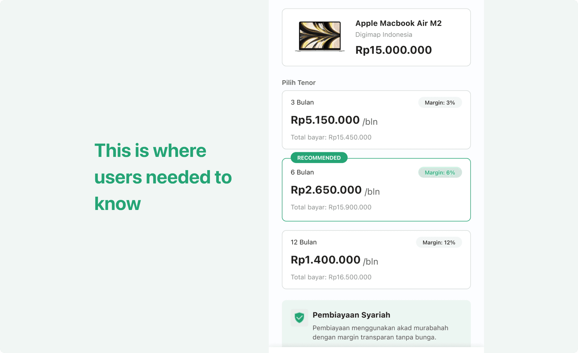
Explaining Noriba's sharia model at onboarding didn't help, by the time users reached tenor selection, they'd forgotten it. So I moved the explanation to where the decision actually happens: an inline card at tenor selection, stating plainly that the model uses a murabahah contract with transparent margin, no interest.
Information only sticks when it arrives at the moment it's needed, not before. This meant no new screen, no extra step, just the right explanation surfacing exactly where hesitation was highest, right before checkout.
TESTING
I ran moderated usability testing with 5 operators, using Maze for task flows and Google Meet for live moderation. Each session paired a task (complete verification, select tenor, checkout) with a SEQ rating immediately after, then a full SUS survey at the end of the session.
Result
Task ease scores rose noticeably on the redesigned verification flow compared to the original 6-step version
SUS results landed comfortably above the industry-average benchmark, reflecting strong perceived usability
4 of 5 participants correctly explained Noriba's sharia model unprompted after seeing the tenor selection card, without having read anything at onboarding
These weren't opinions collected after the fact, they were scores tied to specific tasks, run before and after each fix shipped.
IMPACT
Fixing this wasn't about redesigning screens users already understood. It was about removing the two moments where the process worked against them, once by resetting their effort, once by asking for trust before earning it.
30% drop in KYC drop-off, driven by consolidating verification from 6 steps to 4 and adding persistent save state
5K+ downloads reached, validating the fix at real product scale, not just in testing
Shipped in two weeks, with no backend rebuild required

reflection
Users rarely abandon a product because they don't want it. They abandon it because the experience asks too much at the wrong time. Both problems here had the same fix: stop making users carry the cost of a broken system.
The part I valued most was staying close to the Product Owner every week, turning drop-off signals into a backlog we both trusted. Building the design system alongside this taught me that consistency isn't a nice-to-have, it's what let three separate fixes ship fast without fighting the product's existing patterns.
In financial products, UX isn't just about usability. It's the mechanism through which trust is either built or destroyed.
Noriba — Verification That Keeps People Moving
Reduced onboarding drop-off by 30% on a syariah BNPL platform through a shorter, smarter verification flow.
Role
UI/UX Designer
Industry
Fintech
Team
UI/UX Designer, Product Owner, Marketing, Developer
Year
2025
Background
Noriba is a sharia-compliant buy now pay later platform, offering installments without interest. The product worked. Two experience failures were quietly killing conversion before users ever completed their first purchase.
Understanding the problem
The Goal
Three things had to be true by the end of this project.
Users who exit mid-verification can resume exactly where they left off, with no lost progress.
The explanation of Noriba's akad-based model appears exactly when trust is in question, not three screens before it matters.
Hesitation at tenor selection and checkout turns into confidence, not more text to read.
Key Findings
DEFINE
So what are we actually solving?
How might we let users who exit mid-verification resume exactly where they left off — without losing any completed work?
How might we surface the right explanation at the exact moment users need confidence — not three screens before it matters?
CONSTRAINTS
Every solution had to work within limits that weren't going away.
Regulatory
KYC steps couldn't be removed, only re-sequenced. Verification, financial data, and the sharia agreement stayed mandatory.Timeline
Two weeks before the next release. No room for new architecture.Engineering resources
A full rebuild wasn't feasible. I scoped the fix to what could ship fast, and left deeper changes for the next iteration.
Design Decision 1
FEWER STEPS, NOT FEWER REQUIREMENTS
KYC had six steps, but the requirements behind them hadn't earned that many. I regrouped related inputs, ID with selfie, personal data with address, cutting the flow to four steps without removing a single regulatory checkpoint.
Each extra step is a chance to lose someone. Fewer steps meant fewer chances to quit, without cutting a single requirement compliance needed.
ID + Selfie → Personal Data + Address → Income → Review
Design decision 2
PROGRESS YOU CAN'T LOSE
Exiting mid-flow used to reset everything. Users who left to grab a document, or just got interrupted, came back to a blank form and often didn't finish at all.
I added persistent save state. Every completed step can be saved with a single tap, giving users control over when their progress is locked in. This didn't need a backend rebuild, just session persistence layered onto the existing flow, work that fit the time we had.
DESIGN DECISION 3
CONTEXT AT THE MOMENT OF COMMITMENT
Explaining Noriba's sharia model at onboarding didn't help, by the time users reached tenor selection, they'd forgotten it. So I moved the explanation to where the decision actually happens: an inline card at tenor selection, stating plainly that the model uses a murabahah contract with transparent margin, no interest.
Information only sticks when it arrives at the moment it's needed, not before. This meant no new screen, no extra step, just the right explanation surfacing exactly where hesitation was highest, right before checkout.
TESTING
I ran moderated usability testing with 5 operators, using Maze for task flows and Google Meet for live moderation. Each session paired a task (complete verification, select tenor, checkout) with a SEQ rating immediately after, then a full SUS survey at the end of the session.
Result
Task ease scores rose noticeably on the redesigned verification flow compared to the original 6-step version
SUS results landed comfortably above the industry-average benchmark, reflecting strong perceived usability
4 of 5 participants correctly explained Noriba's sharia model unprompted after seeing the tenor selection card, without having read anything at onboarding
These weren't opinions collected after the fact, they were scores tied to specific tasks, run before and after each fix shipped.
IMPACT
Fixing this wasn't about redesigning screens users already understood. It was about removing the two moments where the process worked against them, once by resetting their effort, once by asking for trust before earning it.
30% drop in KYC drop-off, driven by consolidating verification from 6 steps to 4 and adding persistent save state
5K+ downloads reached, validating the fix at real product scale, not just in testing
Shipped in two weeks, with no backend rebuild required
reflection
Users rarely abandon a product because they don't want it. They abandon it because the experience asks too much at the wrong time. Both problems here had the same fix: stop making users carry the cost of a broken system.
The part I valued most was staying close to the Product Owner every week, turning drop-off signals into a backlog we both trusted. Building the design system alongside this taught me that consistency isn't a nice-to-have, it's what let three separate fixes ship fast without fighting the product's existing patterns.
In financial products, UX isn't just about usability. It's the mechanism through which trust is either built or destroyed.