Floi8 — From Fragmented to Unified Execution
Cut lab automation cycle time by 43%, from 7 hours to 4, for a platform now running across nine biotech labs including Roche, Genentech, and MIT.
Role
End-to-end UX ownership -- User research to handoff
Industry
Biotechnology
Teams
UX Designer, Backend Engineer, SQA, R&D Team.
Year
2026
Context
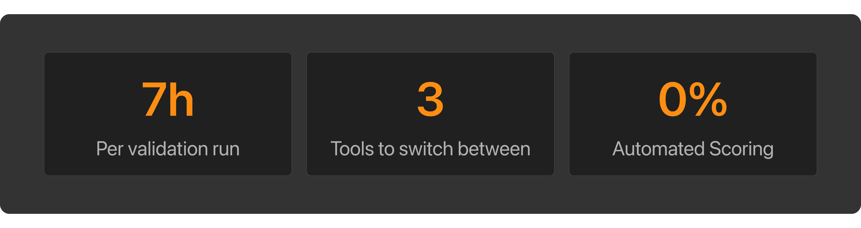
Formulatrix builds lab instruments used by Roche, Genentech, and MIT, but before any machine ships, it has to pass a validation process. That process ran on 3 disconnected tools, took 7 hours per cycle, and depended entirely on whoever happened to be running it that day.
THE PROBLEM
The operators weren’t slow. The process just wasn’t built for them.
The Goal
Three things had to be true by the end of this project:
Operators shouldn't need to touch three different tools just to run one test
Two operators running the same test should land on the same score, every time
When a test fails, operators should know exactly where it stopped, not start over blind
THE FLOW
This is the AS-IS flow, before any redesign. Three distinct phases, all manual, all dependent on the operator.
Setup
Files pulled from server, uploaded separately to two tools. No sync.Execution
If dependency pass, test runs. Mid-run failure? Abort — and start over.Post-processing
Logs parsed by hand. Score calculated manually. Every step.

KEY FINDINGS
Before opening any design tool, I conducted user interviews with operators from engineering, production, and SQA, the people who actually ran the process every day. I chose interviews over surveys because the most critical pain points weren't documented anywhere. They existed as workarounds, habits, and unspoken rules that only surfaced through direct conversation.
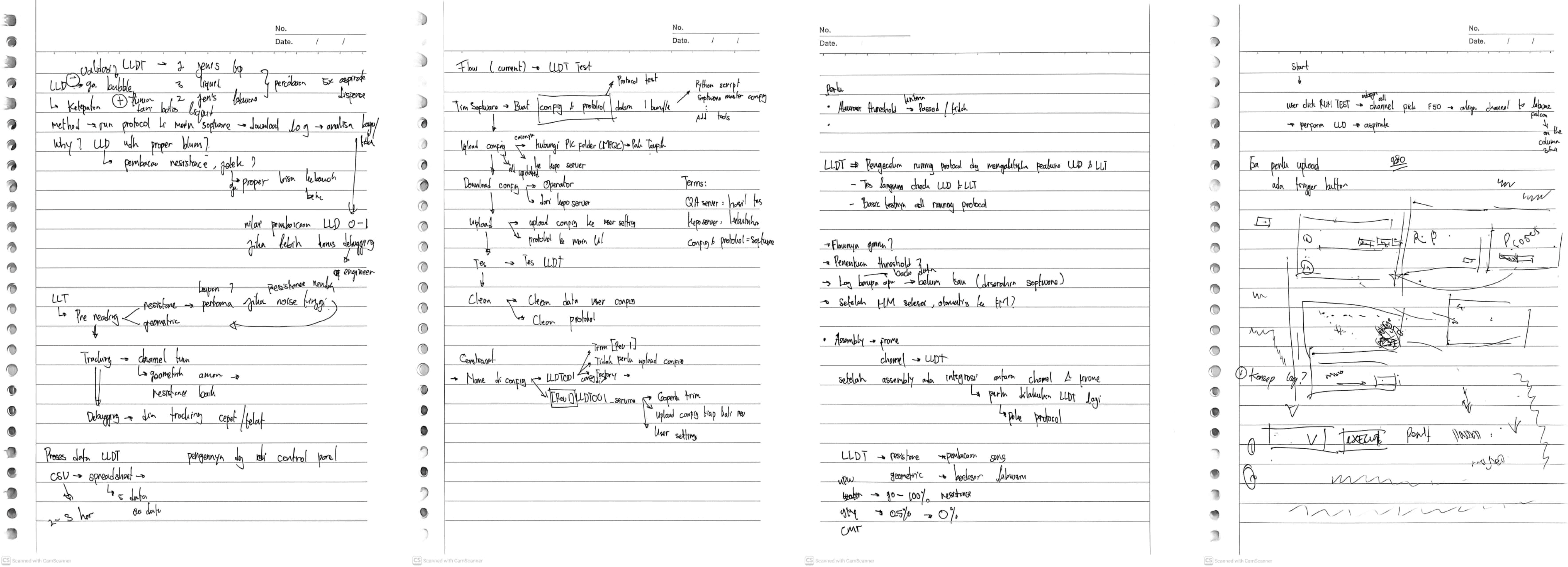
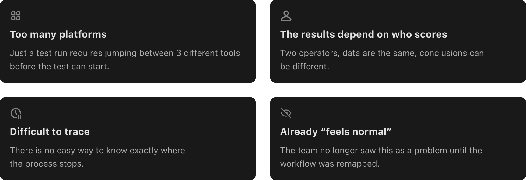
What I found on the field.
THE INTENTIONS
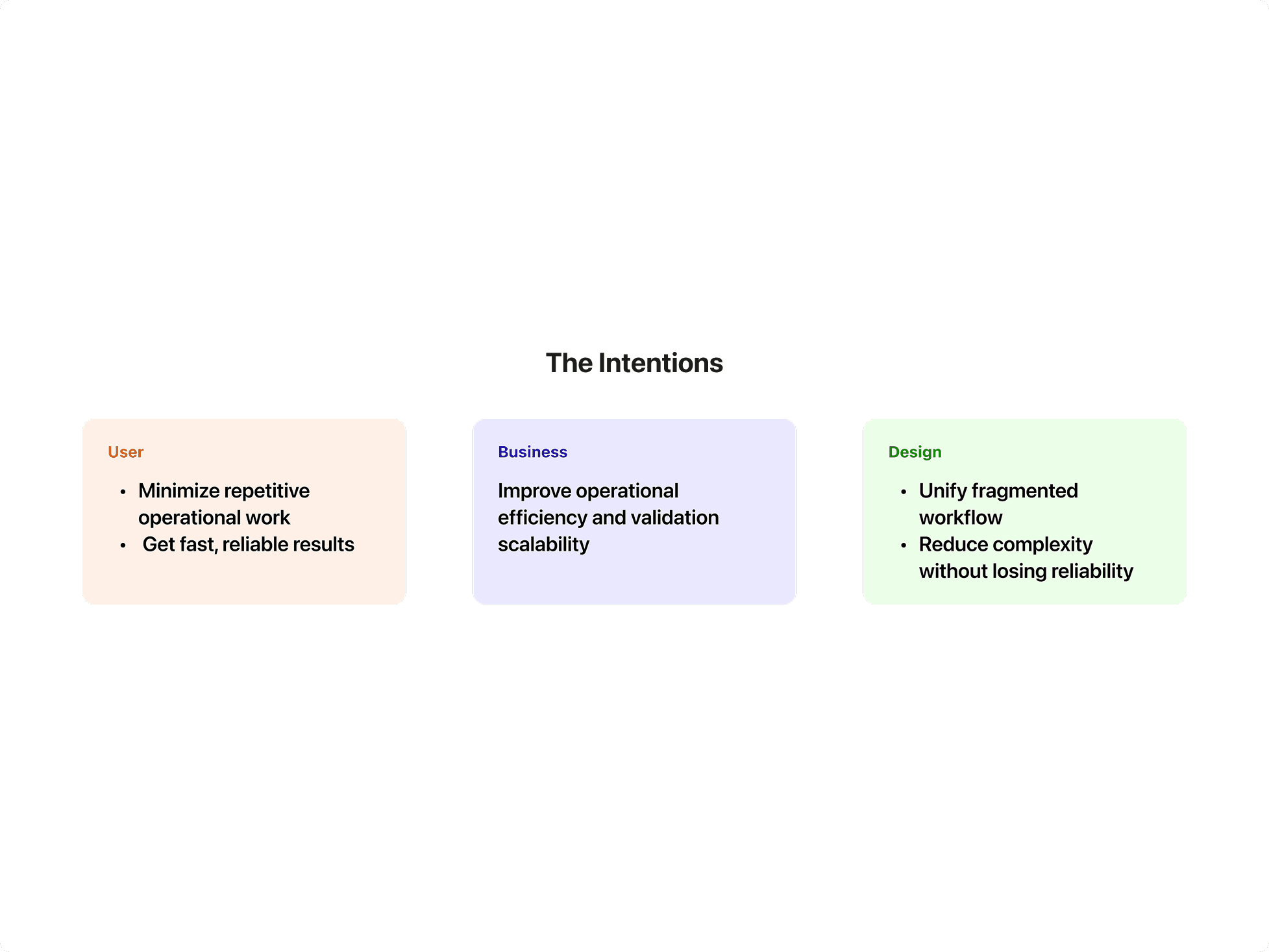
Before touching the interface, I needed to align three directions: what users needed, what the business needed, and what the design should protect.
HOW MIGHT WE
How might we consolidate a fragmented tool stack without disrupting existing engineering workflows?
How might we standardize scoring logic so results hold up regardless of who runs the test, or who reviews it?
How might we make failure states legible in real time, so a broken run costs minutes, not a full 7-hour cycle?
Design Decision 1
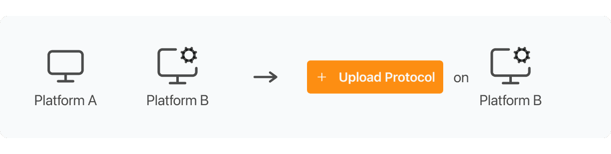
One Upload, Everything Configured
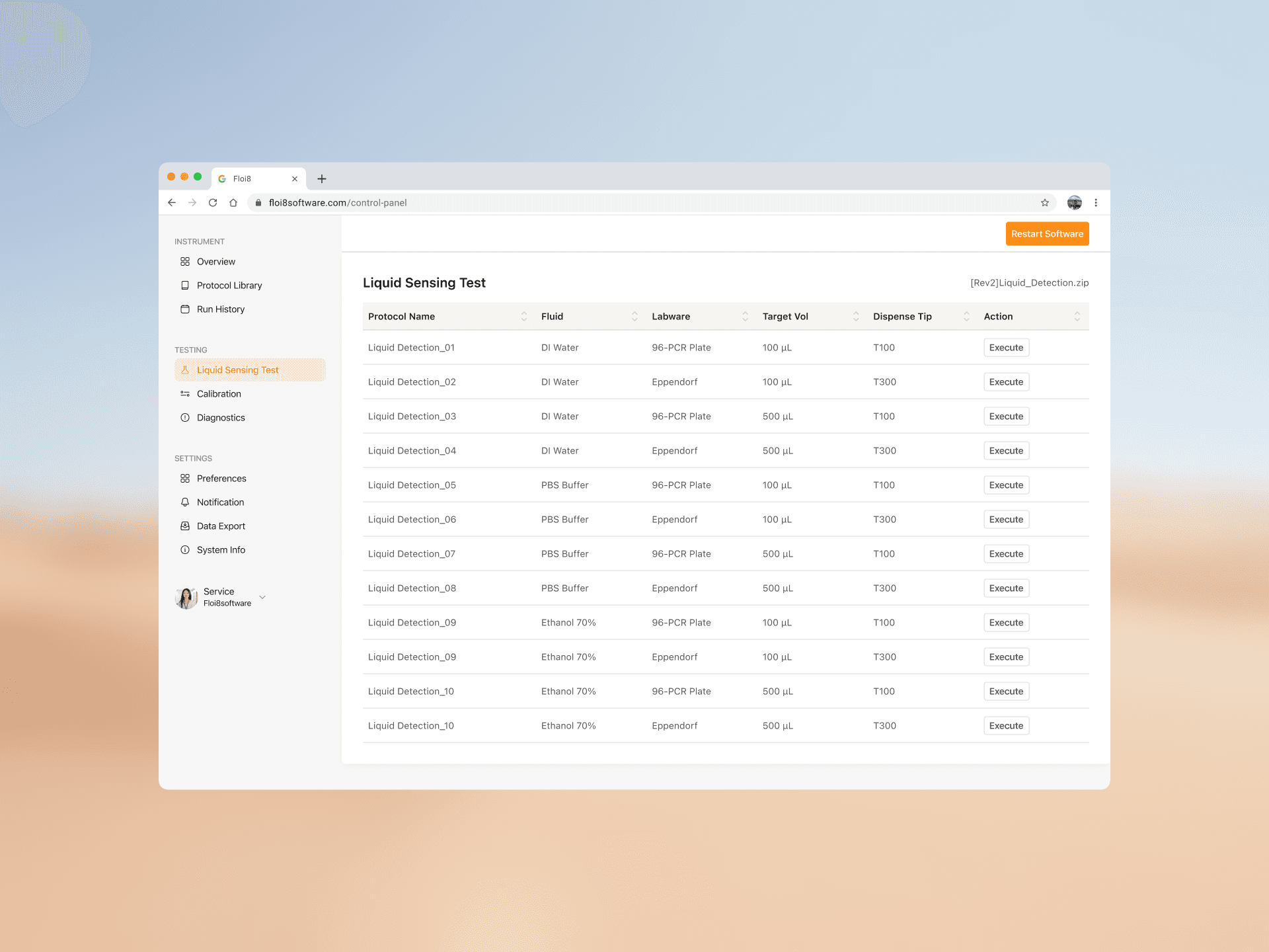
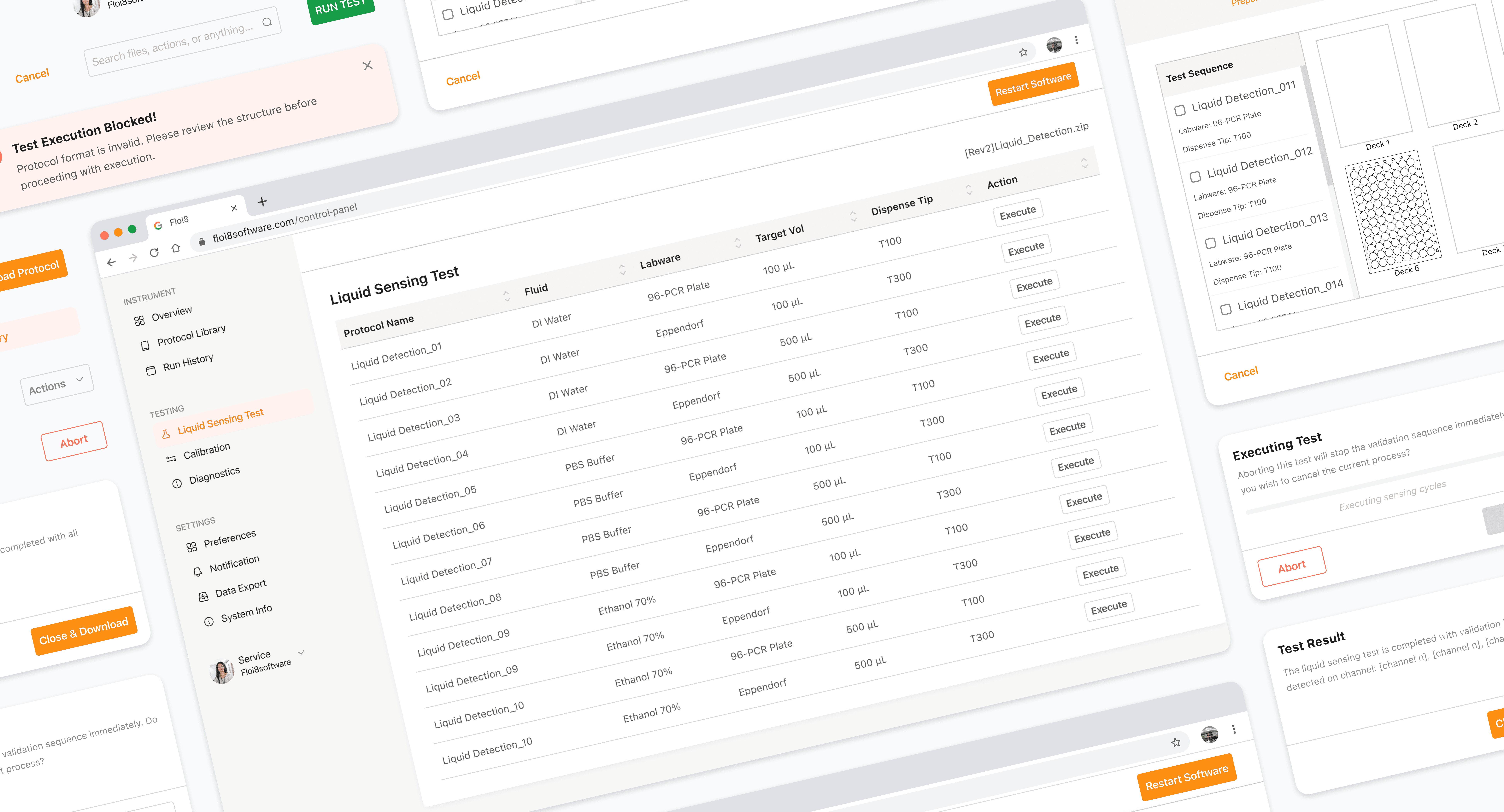
Setup was the first friction point. Operators uploaded protocol and config separately across two synced platforms. I consolidated this into a single upload action inside a dedicated section, not a generic global feature.
I initially proposed a global upload button, but engineering flagged it as inaccurate. Upload wasn't universal, it only applied to specific test types, and each protocol needed validation against that test's config before syncing. A global button risked an unvalidated config reaching the system. I scoped it to where that context already existed, and the team signed off.
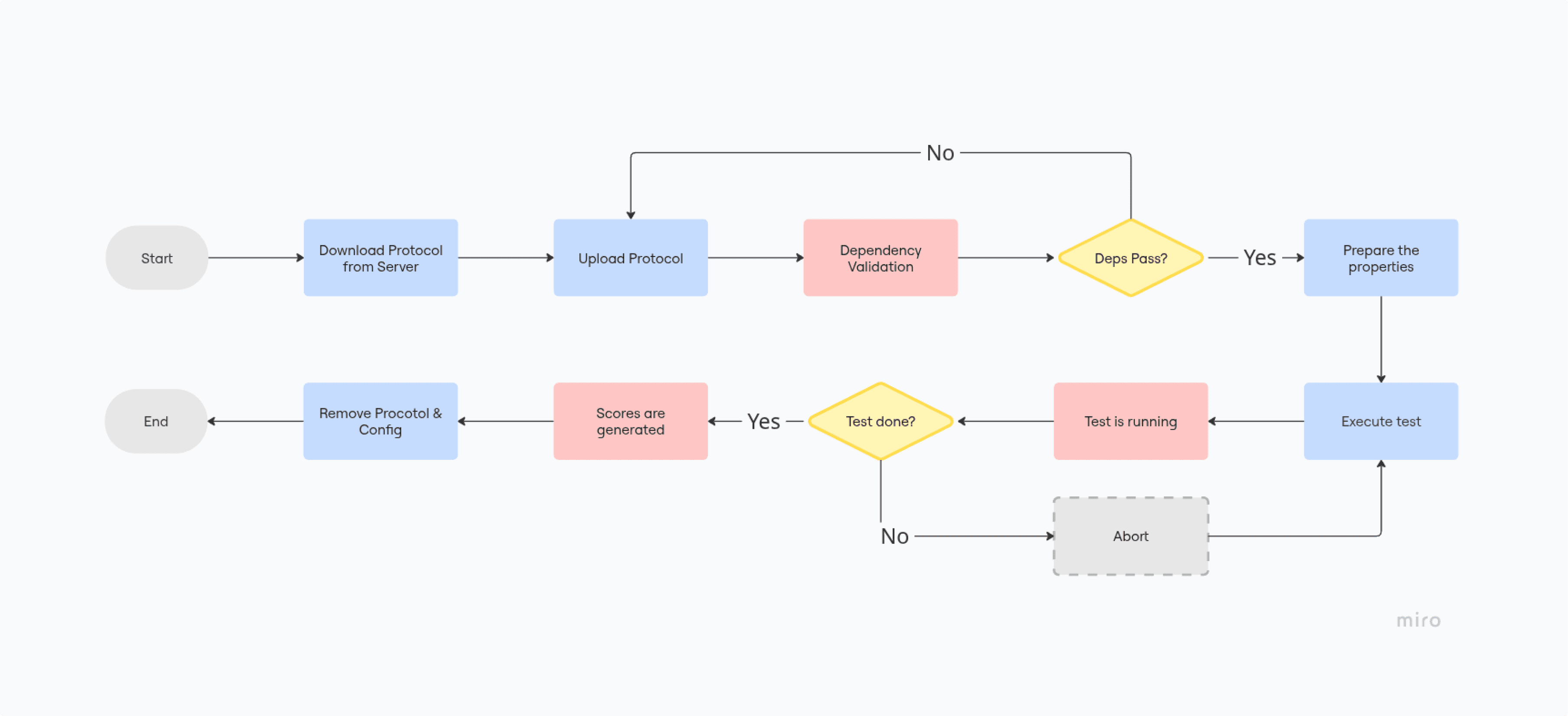
This closed 2 of 3 tool-switching points found in research. The third, manual scoring, comes next.

Design decision 2
A MODAL THAT REMOVES THE GUESSWORK
The manual scoring step was solved on the engineering side, R&D embedded the formula directly into the system, so results now calculate the moment a test finishes. My part of this was making that shift legible to operators.
Operators used to expect a spreadsheet at the end of every run. Removing that step silently would leave them unsure if scoring even happened, or where to find it. I added a confirmation modal that surfaces the score immediately after the test completes, with copy that tells operators plainly, the calculation already happened, here's the result.
This closed the last of the 3 tool-switching points. Setup, execution, and scoring now run in one system, and operators always know it worked.
Updated User Flow (TO-BE)

Edge Cases
Most design decisions cover the ideal flow. But in a lab, things go wrong constantly and I wanted operators to never be left guessing when they do.
Protocol Mismatch on Upload
Mismatches used to surface mid-run, wasting a full test cycle. I moved the check to the upload step and surfaced it as a toast message, a low-friction signal that stops the operator before they waste time, without blocking their screen.
Interrupted Test Execution
When a run stopped unexpectedly, operators had no way to tell what state things were left in. I added real-time state syncing so the system always reflects where the test stopped, and a two-layer confirmation before any abort, preventing an accidental tap from discarding a run still in progress.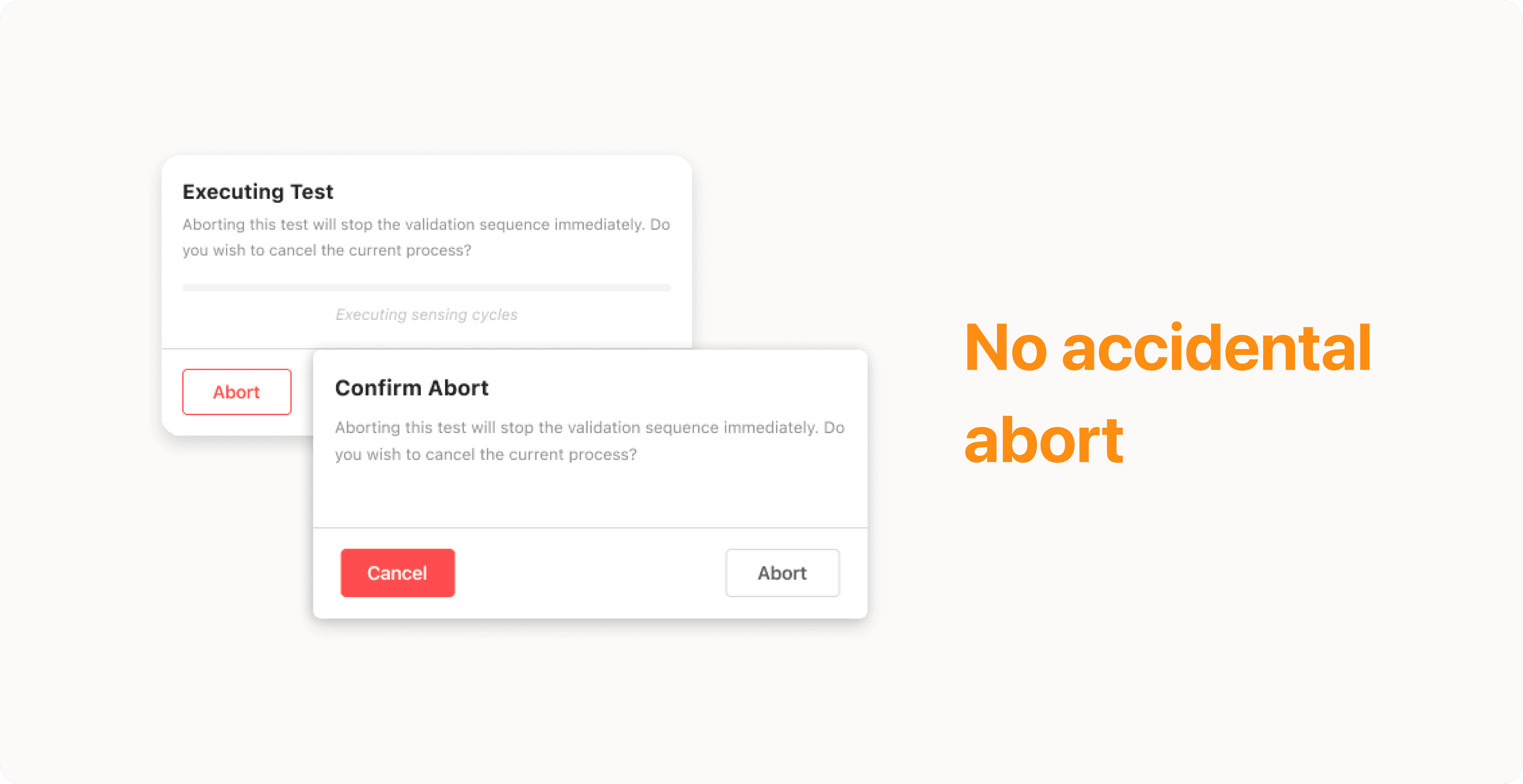
Partial Channel Failure
One failed channel used to fail the whole test, hiding which part actually broke. I redesigned results to show status per channel, using the same confirmation modal from scoring, but with copy that tells operators exactly which channel failed and which passed.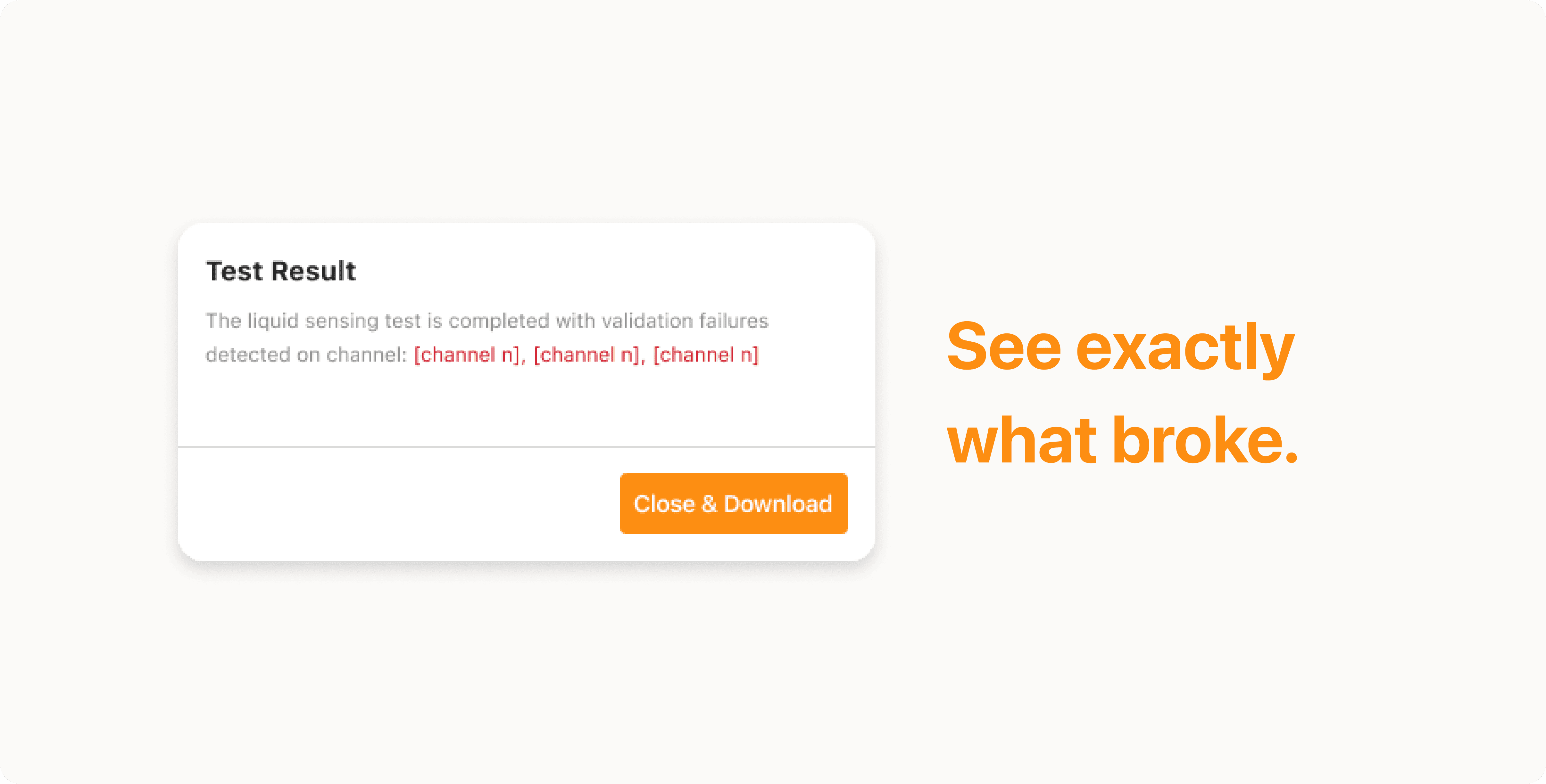
New Test Before Software Update
Blocking new tests until an update landed would have stalled operators completely. I added an info icon that opens a popup explaining the situation, with an Add Config button inside it, letting operators configure manually and keep working, safely, without waiting for the update.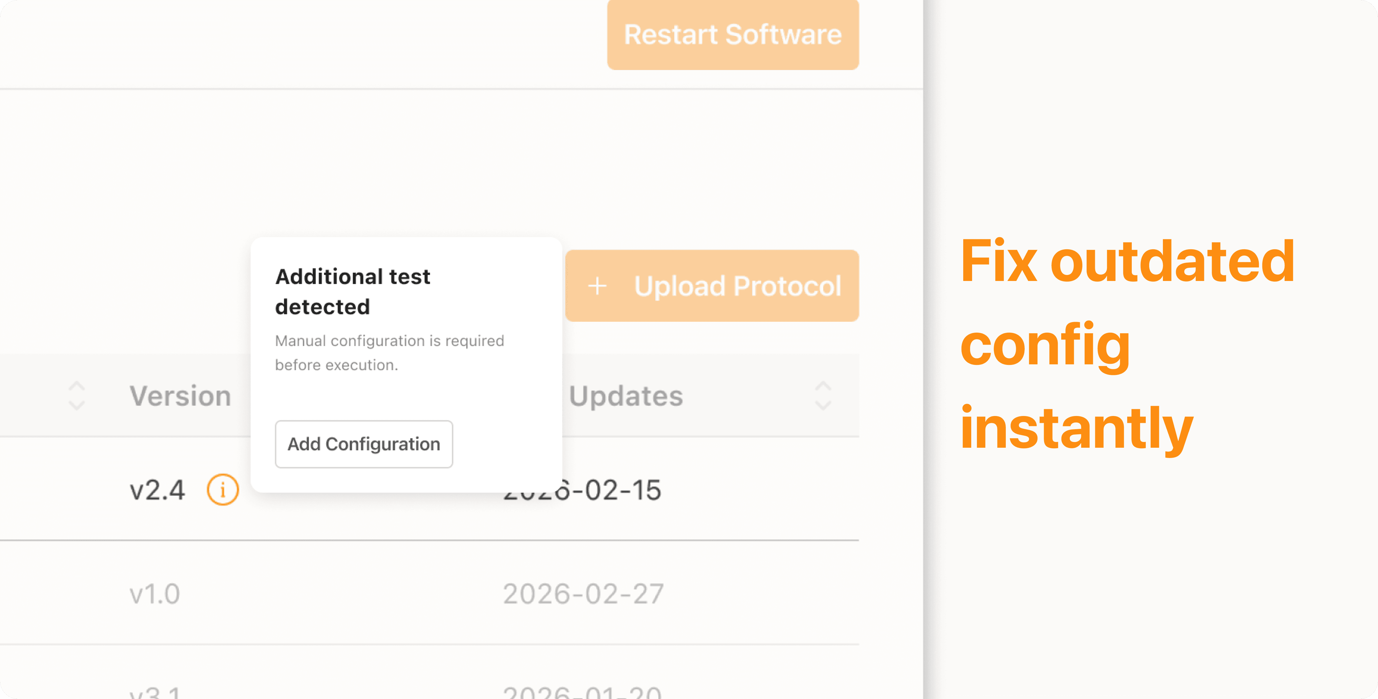
Outcome & Impact
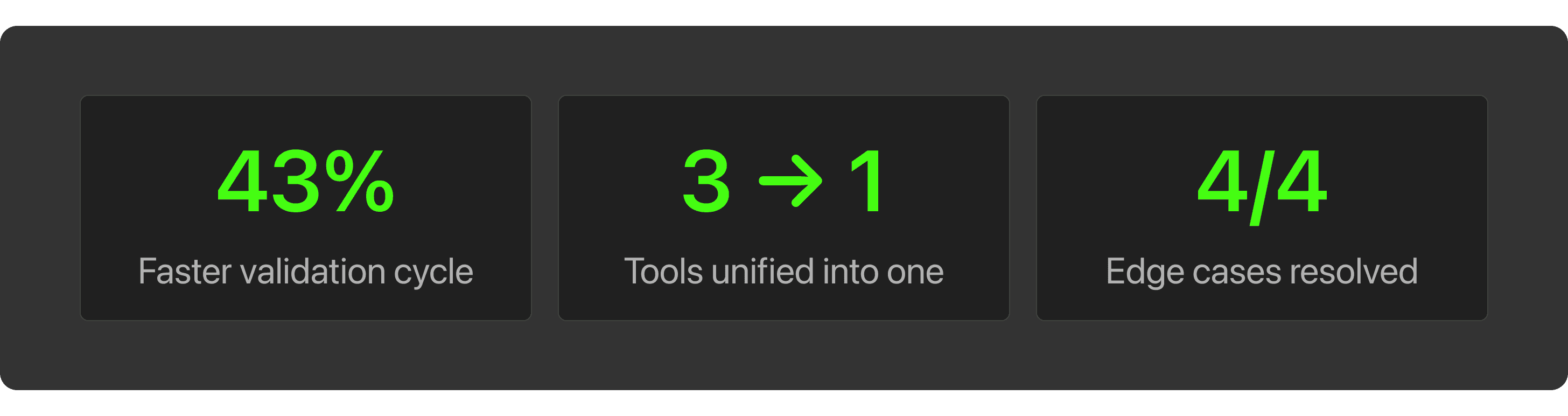
Every manual handoff used to be a place where things could go wrong, a missed sync, an inconsistent score, a test that failed without saying why. Closing those gaps didn't just save time. It gave operators a system they could trust to behave the same way, every run, regardless of who was at the keyboard.
TESTING & VALIDATION
Every decision in this project went through 3 rounds of moderated usability testing with operators from engineering, production, and SQA, run in parallel with iterative design sprints.
What changed between rounds:
Round 1 surfaced the pushback on the global upload button, leading to the scoped, test-specific section in Decision 1
Round 2 tested the auto-scoring modal copy, refined until operators consistently trusted the result without needing to double-check manually
Round 3 validated the edge case flows, confirming operators understood system state during aborts and partial failures without additional guidance
Testing didn't just confirm the designs worked. It shaped what got built in the first place.
reflection
The real design challenge wasn't the interface. It was convincing a team to question a process they'd lived with for years, and align three functions, engineering, R&D, and operators, around a single source of truth.
Every decision here had a constraint attached. Upload couldn't be a simple global button because the system required test-specific validation. Scoring couldn't be redesigned from scratch because R&D had already defined the logic, my job was to make that logic visible, not to rebuild it. Working within those boundaries, not around them, produced a better outcome than a clean-slate redesign would have.
When something is broken long enough, it stops feeling broken. Making that visible, and getting three teams to agree on what "fixed" should look like, was the first thing I designed.
Floi8 — From Fragmented to Unified Execution
Cut lab automation cycle time by 43%, from 7 hours to 4, for a platform now running across nine biotech labs including Roche, Genentech, and MIT.
Role
End-to-end UX ownership -- User research to handoff
Industry
Biotechnology
Teams
UX Designer, Backend Engineer, SQA, R&D Team.
Year
2026
Context
Formulatrix builds lab instruments used by Roche, Genentech, and MIT, but before any machine ships, it has to pass a validation process. That process ran on 3 disconnected tools, took 7 hours per cycle, and depended entirely on whoever happened to be running it that day.
THE PROBLEM
The operators weren’t slow. The process just wasn’t built for them.
The Goal
Three things had to be true by the end of this project:
Operators shouldn't need to touch three different tools just to run one test
Two operators running the same test should land on the same score, every time
When a test fails, operators should know exactly where it stopped, not start over blind
THE FLOW
This is the AS-IS flow, before any redesign. Three distinct phases, all manual, all dependent on the operator.
Setup
Files pulled from server, uploaded separately to two tools. No sync.Execution
If dependency pass, test runs. Mid-run failure? Abort — and start over.Post-processing
Logs parsed by hand. Score calculated manually. Every step.
KEY FINDINGS
Before opening any design tool, I conducted user interviews with operators from engineering, production, and SQA, the people who actually ran the process every day. I chose interviews over surveys because the most critical pain points weren't documented anywhere. They existed as workarounds, habits, and unspoken rules that only surfaced through direct conversation.
What I found on the field.
THE INTENTIONS
Before touching the interface, I needed to align three directions: what users needed, what the business needed, and what the design should protect.
HOW MIGHT WE
How might we consolidate a fragmented tool stack without disrupting existing engineering workflows?
How might we standardize scoring logic so results hold up regardless of who runs the test, or who reviews it?
How might we make failure states legible in real time, so a broken run costs minutes, not a full 7-hour cycle?
Design Decision 1
One Upload, Everything Configured
Setup was the first friction point. Operators uploaded protocol and config separately across two synced platforms. I consolidated this into a single upload action inside a dedicated section, not a generic global feature.
I initially proposed a global upload button, but engineering flagged it as inaccurate. Upload wasn't universal, it only applied to specific test types, and each protocol needed validation against that test's config before syncing. A global button risked an unvalidated config reaching the system. I scoped it to where that context already existed, and the team signed off.
This closed 2 of 3 tool-switching points found in research. The third, manual scoring, comes next.
Design decision 2
A MODAL THAT REMOVES THE GUESSWORK
The manual scoring step was solved on the engineering side, R&D embedded the formula directly into the system, so results now calculate the moment a test finishes. My part of this was making that shift legible to operators.
Operators used to expect a spreadsheet at the end of every run. Removing that step silently would leave them unsure if scoring even happened, or where to find it. I added a confirmation modal that surfaces the score immediately after the test completes, with copy that tells operators plainly, the calculation already happened, here's the result.
This closed the last of the 3 tool-switching points. Setup, execution, and scoring now run in one system, and operators always know it worked.
Updated User Flow (TO-BE)
Edge Cases
Most design decisions cover the ideal flow. But in a lab, things go wrong constantly and I wanted operators to never be left guessing when they do.
Protocol Mismatch on Upload
Mismatches used to surface mid-run, wasting a full test cycle. I moved the check to the upload step and surfaced it as a toast message, a low-friction signal that stops the operator before they waste time, without blocking their screen.
Interrupted Test Execution
When a run stopped unexpectedly, operators had no way to tell what state things were left in. I added real-time state syncing so the system always reflects where the test stopped, and a two-layer confirmation before any abort, preventing an accidental tap from discarding a run still in progress.Partial Channel Failure
One failed channel used to fail the whole test, hiding which part actually broke. I redesigned results to show status per channel, using the same confirmation modal from scoring, but with copy that tells operators exactly which channel failed and which passed.
New Test Before Software Update
Blocking new tests until an update landed would have stalled operators completely. I added an info icon that opens a popup explaining the situation, with an Add Config button inside it, letting operators configure manually and keep working, safely, without waiting for the update.
Outcome & Impact
Every manual handoff used to be a place where things could go wrong, a missed sync, an inconsistent score, a test that failed without saying why. Closing those gaps didn't just save time. It gave operators a system they could trust to behave the same way, every run, regardless of who was at the keyboard.
TESTING & VALIDATION
Every decision in this project went through 3 rounds of moderated usability testing with operators from engineering, production, and SQA, run in parallel with iterative design sprints.
What changed between rounds:
Round 1 surfaced the pushback on the global upload button, leading to the scoped, test-specific section in Decision 1
Round 2 tested the auto-scoring modal copy, refined until operators consistently trusted the result without needing to double-check manually
Round 3 validated the edge case flows, confirming operators understood system state during aborts and partial failures without additional guidance
Testing didn't just confirm the designs worked. It shaped what got built in the first place.
reflection
The real design challenge wasn't the interface. It was convincing a team to question a process they'd lived with for years, and align three functions, engineering, R&D, and operators, around a single source of truth.
Every decision here had a constraint attached. Upload couldn't be a simple global button because the system required test-specific validation. Scoring couldn't be redesigned from scratch because R&D had already defined the logic, my job was to make that logic visible, not to rebuild it. Working within those boundaries, not around them, produced a better outcome than a clean-slate redesign would have.
When something is broken long enough, it stops feeling broken. Making that visible, and getting three teams to agree on what "fixed" should look like, was the first thing I designed.